calibrador
Miembro 8K
- Registrado
- 6 Septiembre 2018
- Ubicación
- Valencia o Denia
Ante las numerosas consultas que voy recibiendo sobre este tema, he creído conveniente abrir este hilo donde vamos a tratar la importancia de mantener, en la medida de lo posible, un ambiente de visualización correcto bajo unas condiciones de luz ambiental controlada específicas, lo cual nos ayudará a preservar la fidelidad de la imagen y una correcta percepción del color, ademas de mitigar las sensaciones de cansancio visual después de horas de visionado en ambientes de oscuridad total.
Aquí no se trata de consejos a la ligera, sino de recomendaciones basadas en la ciencia de la imagen y del color, la cual nos indica que para una correcta visualización deberíamos encontrarnos bajo un ambiente de luz controlada de home cinema, y en ese sentido, unas paredes de tonos neutras colocando una luz de sesgo de temperatura de color D65 situada detrás de la pantalla deberían ser suficientes para emular un ambiente de referencia, siempre que dicha luz cumpla con el requisito de certificación D65, y que su capacidad lumínica envolvente detrás de la pantalla se ajuste y regule a los 5 nits (algunos oponían que 10) para contenidos SDR, y 5 nits para HDR, siendo éste último un factor crítico al tratarse de un estándar absoluto (PQ ST2084) donde a un nivel específico de vídeo se corresponde un valor absoluto de luminancia, lo cual, como digo, es un factor crítico en alto rango dinámico porque los detalles más oscuros son de valores específicos de luminancia realmente bajos. Es por ello, que en HDR sea fundamental, como más adelante matiza el propio Steve Shaw, mantener el ambiente de visualización de la manera más parecida posible a la del propio entorno de referencia profesional HDR. Y tened en cuenta que, si bajo dichas condiciones ambientales de referencia, los coloristas ya son capaces de trabajar y diseñar las secuencias más oscuras, viendo durante todo el proceso el detalle en sombra presente en el contenido, significa que si nosotros emulamos ese ambiente de luz controlada también podremos discernir todo el detalle en sombra presente por muy oscura que sea la secuencia a reproducir, ya que si los coloristas en tales circunstancias lo ven, nosotros en las mismas condiciones, pero en pantallas de consumo mucho más grandes que la que utilizan en los estudios, pues obviamente también deberíamos verlo.
Ahora os facilito información profesional del sector, tanto de calibradores, como de especificaciones y de incluso de discos de calibración que incluyen entre sus opciones diferentes patrones para ajustar en la medida de lo posible la correcta incidencia de muestra luz de sesgo en el ambiente, ya que esto se puede realizar de dos maneras. O midiendo con material adecuado, o simplemente bajo inspección visual mediante el uso de patrones específicos bias light, y cualquiera de las dos formas es válida y efectiva.
THE IMPORTANCE OF VIEWING ENVIRONMENT CONDITIONS IN A REFERENCE DISPLAY SYSTEM
THE GOAL:
The author’s purpose in this paper is to enlighten imaging industry professionals and home entertainment consumers in a seldom discussed and little understood dimension of optimum video display system design and installation. It’s the position of this paper that video is fundamentally a mass communication medium. The objective in such a medium is to convey an original message without loss, confusion, distortion or misunderstanding. Video relies upon images more so than words to carry its message. To convey more beautiful pictures is at the heart of the current HDTV revolution. This paper will focus more specifically upon home theater and the faithful reproduction of cinematic art via video displays.
Home cinema has developed into a major form of entertainment, enjoyment, escape, and relaxation for the contemporary consumer. The author recognizes an increasing interest in electronic image quality in our culture today. What follows is intended to better inform anyone curious about how to produce the most beautiful pictures in the home, which our current technology can provide. The practical keys that follow should serve as a guide in insuring that the costly electronic devices used in home entertainment systems will perform optimally, and communicate the art of cinema in the most faithful, beautiful and enjoyable way.
THE THEORY:
Electronic imaging is composed of both science and art. The science of imaging studies both the technologies involved and human perceptual factors. Any fully integrated and comprehensive approach to electronic display system design, installation, and calibration must take into account every component in the system. These components include: electronic device hardware, inter-connect cabling, program signals, room conditions, and last (but far from least) the viewer. A complete study and application of imaging science principles must encompass all of the above components. Ignoring any one of these can result in diminished total system performance. Diminished performance effectively reduces the value of the system.
The viewing environment is the least understood and, therefore, frequently ignored element in proper display system design, implementation and calibration. Viewing conditions always affect display performance, human perception of the image on the screen, and viewer comfort. A properly calibrated display will not be perceived correctly if there are conflicting viewing environment conditions.
The Society of Motion Picture and Television Engineers (SMPTE) is responsible for developing standards and practices for the motion imaging industries. Their recommended practices document, RP166-1995: ‘Critical Viewing Conditions For Evaluation Of Color Television Pictures,’ deals specifically with viewing room conditions and human perceptual factors in reference display environments. SMPTE’s human factors research found that viewing conditions profoundly affect the way video images appear and also impact viewing comfort. Their work applies to all forms of electronic displays and is beneficial for computer monitor use, digital graphics design, digital photography, electronic interactive games, technical, medical, industrial, security applications, home theater, etc.
Professional monitor environments (where critical image analysis is conducted for mastering video programs) use tightly controlled ambient lighting and neutral colored surfaces surrounding the display.
HDR REFERENCE VIEWING ENVIRONMENT
Specifications for a HDR colour critical Reference Viewing Environment are also defined by various standards bodies, including SMPTE and the ITU-R. Specifications for a Home Viewing Environment do not presently exist, due in part to issues with the absolute nature of the PQ HDR specification.
The following defines the basic standards for a HDR Reference Viewing Environment, and match those for HDTV.
1.5 screen height**: This relates to the UHD TV screen resolution, rather than HDR (High Dynamic Range).
HDR HOME VIEWING ENVIRONMENT
While there is no specification for a HDR Home Viewing Environment, is should be obvious that varying the home environment from the above reference environment will result in viewing issues, especially for PQ based HDR as it is an absolute standard - input signal bit levels = absolute output brightness levels.

 www.lightillusion.com
También se recomienda desde los discos de calibración más importantes del mundo, los cuales incluyen patrones y recomendaciones muy especificas para un correcto entorno de visualización bad condiciones de luz controladas. Por ejemplo, los patrones de referencia internacional Mascior, que cuenta con soluciones para todos los estándares, incluidos patrones DOLBY VISION
 diversifiedvideosolutions.com
Miscellaneous Patterns continued
Ambient Light Test Patterns
These patterns offer a means to adjust ambient lighting (aka: bias lighting) on the wall behind the display via a visual comparison to the brightness of the various windows. Many users of this program will not have access to a spot photometer or suitable spectroradiometer to measure the luminance on the wall. The study of human visual perception is at the foundation of the video medium. Human vision is the basis of imaging science and technologies that seek to produce artificial images. Ambient lighting and surrounding colors in the viewing environment affect how the viewer perceives the image on a TV screen or electronic monitor. An otherwise "perfectly" calibrated display cannot deliver a reference image to the viewer in a non-reference environment. Video industry standards bodies (SMPTE, ITU, EBU, ATSC, etc.) and video engineers have understood these principles for over a half century.
A 'Reference Viewing Environment' has been specified to include a neutral gray "surround" and low level back lighting that is CIE D65 (aka: 6505K CCT) behind the monitor for decades. The room is to be devoid of any substantial additional lighting. These reference conditions are designed to minimize screen reflections, haze, and glare, plus relieve eye strain and preserve accurate color perception. All of the current display calibration specifications are taken from the standards
best practices used in the professional mastering of video programs. Such standards and best practices are used throughout the industry to insure consistent and unified program production, post-production, and program reproduction (image fidelity).
This UHD/HDR10 calibration program is primarily intended for the newest video displays. The most recent revision of reference viewing environment standards and recommended practice by the Society of Motion Picture and Television Engineers (SMPTE) specifies a formal standard of an ambient light level of 5 nits (cd/m2). This is also the most recent recommended practice specified for HDR imaging by the International Telecommunications Union (ITU). Both of these standards bodies specify the display to be calibrated to 100 nits for peak white, using a specific sized window pattern. The ambient light level visual comparison patterns in this program have 5, 10, and 15 nit windows derived from the formula for calculating the electrical optical transfer function (EOTF}, or Perceptual Quantizer Transfer Function (PQ), for HDR (SMPTE ST 2084:2014). The 10 and 15 nit window patterns are for comparison with older recommended practice as noted in the patterns.
How to use the patterns
Simply display the pattern of choice after calibrating the display while visually adjusting the ambient lighting on the wall behind the display in an otherwise light-less room. Visually compare the level of light on the wall to the level of light in the window. PLUGE patterns are included with the window for tweaking the black level (aka: brightness) of the display with the ambient light present. This is to insure the adequate perception of shadow detail in the final image.

Miscellaneous Patterns continued
5 nit window pattern: Above the window- "Ambient Light Level Visual Comparison“ Below the window- "Formal standard of 5 nits (cd/m2) SMPTE ST 2080-3:2017, for HDTV“, "ITU-R BT.2100-0-(07/2016), recommended practice for HDR"
10 nit window pattern: Above the window- "Ambient Light Level Visual Comparison“ Below the window- "Recommended practice of 10% of a peak white at 100 nits (cd/m2)“, "SMPTE RP 166-1995, for SDTV; ITU-R BT.2035 (07/2013), for HDTV"
15 nit window pattern: Above the window- "Ambient Light Level Visual Comparison“ Below the window- "Recommended practice of 15% of a peak white at 150-250 nits (cd/m2)“, "ITU-R BT.710-4 (11/98), for consumer HDTV environments"
Incluso los discos de calibración, todos, de Spears & Munsil, lo recomiendan, e incluyen patrones Ambient Light Test Patterns para ajustar convenientemente el entorno de visualización.

Bias Light
These patterns are designed to be a reference when setting up a bias light behind or around your display.
If you choose to use a bias light, decide whether you would prefer a 10% or 15% light, then use the appropriate pattern to show a reference on screen. Put the pattern up on screen, set up the bias light behind the display, and adjust the dimmer or mask the bias light so that the light spill right at the edge of the display matches the intensity of the on-screen rectangle.
Note that the reference is calculated in linear space, so if your display is not calibrated to 2.4 gamma, the reference level will not be perfectly correct. It should be close enough for this specific purpose of setting up a bias light.


Y sobre tecnología OLED
Bias Lighting and OLED: Why do I need Bias Lighting when my OLED produces "perfect" blacks.
A lot of people mistakenly believe that bias lighting will result in crushed blacks. You won't get black crush with brightness levels set correctly both on the display and on the bias light. Above the zero state, there are many levels of brightness. HDR and 4K both introduce more detail which will absolutely get lost during scenes with specular highlights and a darkened room, just to give one example.
If wide swaths of your display are totally black right now, you are probably already crushing blacks. If you use a PLUGE pattern -- some are available to stream on YouTube --just ensure that they include below black levels as some encoding can crush "illegal" black levels. Here's a reference for bias lighting that includes a PLUGE pattern on the sides. (excuse the music") ) If you can see the bars, you definitely aren't crushing blacks.
) If you can see the bars, you definitely aren't crushing blacks.
Besides the capability of the display, we have the content, which doesn't always go to zero. So the content can also look better in spite of the capabilities of the display (SDR 8-bit content - and that's a lot of it, for example). But to fixate on the darkness when HDR offers so much more, I think shortchanges many of the benefits of OLED.
Hollywood colorists grading on professional OLED monitors use bias lighting too. It's not about picture quality of the display but rather our ABILITY to see that picture quality. It's how (non-prescription) sunglasses can improve our vision when driving our car. Putting aside the fact that it absolutely has ergonomic benefits, it enhances our ability to see the picture. The color appears more vivid and the picture is often sharper. Why sharper? The photopupillary reflex narrows the pupils and just like when we stop down a camera, a greater depth of field falls into focus.
Our home theaters are digital, HDR, 4k, but our eyes are much more refined and sensitive analog/human factors in determining what we see. What looks great to us now in home theater technology ALWAYS inevitably sucks in 10 years when the next technology comes along. Remember when we said we couldn't even see the pixels on 1080p? Remember 1080i? We obviously all know that the picture can get better because it always does, as does our ability to pick it apart.
Joel Silver from ISF likes to say that everyone has opinions about how to set up a TV, but there are defined standards that are accepted internationally. We're all entitled to our preferences too. When I'm working on my computer for non color-critical work, I set my bias lighting much higher than the standards.
https://www.biaslighting.com/blogs/...lighting-when-my-oled-produces-perfect-blacks
Joe Kane
También tenéis opiniones profesionales aquí, en este tema de Avsforum

 www.avsforum.com
"Sticky" threads from the calibrator forum regarding bias lighting and video viewing environment principles:
'D65 Video Bias Lighting- Fundamental Theory And Practice'
https://www.avsforum.com/avs-vb/showthread.php?t=1162578
'How Viewing Environment Conditions Can Corrupt Or Enhance Your Calibration.'
https://www.avsforum.com/avs-vb/showthread.php?t=849430
Also:
'The Room Is A Video Component'- Home Theater Geeks #182- Video Interview
https://www.avsforum.com/forum/138-av...#post_23953177
Also:
'The Importance of Viewing Environment Conditions in a Reference Display System'
http://cinemaquestinc.com/ive.htm
Best regards and beautiful pictures,
G. Alan Brown, President
CinemaQuest, Inc.
SMPTE, THX, ISF, Lion AV Consultants
"Advancing the art and science of electronic imaging"
www.avsforum.com
Y yo personalmente recomiendo esta solución.
 www.biaslighting.com
Esa es una solución que cuenta con la debida certificación 6500K para una óptima visualización y que funciona francamente bien.


Diferencias entre una luz de sesgo certificada D65 y una que no lo está. La certificada es la solución de MediaLight, y la segunda es una tira de leds de unos 20 euros de Leroy Merlin.
Certificada 6500K
NO certificada


Aquí no se trata de consejos a la ligera, sino de recomendaciones basadas en la ciencia de la imagen y del color, la cual nos indica que para una correcta visualización deberíamos encontrarnos bajo un ambiente de luz controlada de home cinema, y en ese sentido, unas paredes de tonos neutras colocando una luz de sesgo de temperatura de color D65 situada detrás de la pantalla deberían ser suficientes para emular un ambiente de referencia, siempre que dicha luz cumpla con el requisito de certificación D65, y que su capacidad lumínica envolvente detrás de la pantalla se ajuste y regule a los 5 nits (algunos oponían que 10) para contenidos SDR, y 5 nits para HDR, siendo éste último un factor crítico al tratarse de un estándar absoluto (PQ ST2084) donde a un nivel específico de vídeo se corresponde un valor absoluto de luminancia, lo cual, como digo, es un factor crítico en alto rango dinámico porque los detalles más oscuros son de valores específicos de luminancia realmente bajos. Es por ello, que en HDR sea fundamental, como más adelante matiza el propio Steve Shaw, mantener el ambiente de visualización de la manera más parecida posible a la del propio entorno de referencia profesional HDR. Y tened en cuenta que, si bajo dichas condiciones ambientales de referencia, los coloristas ya son capaces de trabajar y diseñar las secuencias más oscuras, viendo durante todo el proceso el detalle en sombra presente en el contenido, significa que si nosotros emulamos ese ambiente de luz controlada también podremos discernir todo el detalle en sombra presente por muy oscura que sea la secuencia a reproducir, ya que si los coloristas en tales circunstancias lo ven, nosotros en las mismas condiciones, pero en pantallas de consumo mucho más grandes que la que utilizan en los estudios, pues obviamente también deberíamos verlo.
Ahora os facilito información profesional del sector, tanto de calibradores, como de especificaciones y de incluso de discos de calibración que incluyen entre sus opciones diferentes patrones para ajustar en la medida de lo posible la correcta incidencia de muestra luz de sesgo en el ambiente, ya que esto se puede realizar de dos maneras. O midiendo con material adecuado, o simplemente bajo inspección visual mediante el uso de patrones específicos bias light, y cualquiera de las dos formas es válida y efectiva.
THE IMPORTANCE OF VIEWING ENVIRONMENT CONDITIONS IN A REFERENCE DISPLAY SYSTEM
THE GOAL:
The author’s purpose in this paper is to enlighten imaging industry professionals and home entertainment consumers in a seldom discussed and little understood dimension of optimum video display system design and installation. It’s the position of this paper that video is fundamentally a mass communication medium. The objective in such a medium is to convey an original message without loss, confusion, distortion or misunderstanding. Video relies upon images more so than words to carry its message. To convey more beautiful pictures is at the heart of the current HDTV revolution. This paper will focus more specifically upon home theater and the faithful reproduction of cinematic art via video displays.
Home cinema has developed into a major form of entertainment, enjoyment, escape, and relaxation for the contemporary consumer. The author recognizes an increasing interest in electronic image quality in our culture today. What follows is intended to better inform anyone curious about how to produce the most beautiful pictures in the home, which our current technology can provide. The practical keys that follow should serve as a guide in insuring that the costly electronic devices used in home entertainment systems will perform optimally, and communicate the art of cinema in the most faithful, beautiful and enjoyable way.
THE THEORY:
Electronic imaging is composed of both science and art. The science of imaging studies both the technologies involved and human perceptual factors. Any fully integrated and comprehensive approach to electronic display system design, installation, and calibration must take into account every component in the system. These components include: electronic device hardware, inter-connect cabling, program signals, room conditions, and last (but far from least) the viewer. A complete study and application of imaging science principles must encompass all of the above components. Ignoring any one of these can result in diminished total system performance. Diminished performance effectively reduces the value of the system.
The viewing environment is the least understood and, therefore, frequently ignored element in proper display system design, implementation and calibration. Viewing conditions always affect display performance, human perception of the image on the screen, and viewer comfort. A properly calibrated display will not be perceived correctly if there are conflicting viewing environment conditions.
The Society of Motion Picture and Television Engineers (SMPTE) is responsible for developing standards and practices for the motion imaging industries. Their recommended practices document, RP166-1995: ‘Critical Viewing Conditions For Evaluation Of Color Television Pictures,’ deals specifically with viewing room conditions and human perceptual factors in reference display environments. SMPTE’s human factors research found that viewing conditions profoundly affect the way video images appear and also impact viewing comfort. Their work applies to all forms of electronic displays and is beneficial for computer monitor use, digital graphics design, digital photography, electronic interactive games, technical, medical, industrial, security applications, home theater, etc.
Professional monitor environments (where critical image analysis is conducted for mastering video programs) use tightly controlled ambient lighting and neutral colored surfaces surrounding the display.
CinemaQuest, Inc.
Providing Ideal-Lume bias lighting, custom home theater, and Imaging Science Foundation trained dealers and services.
cinemaquestinc.com
HDR REFERENCE VIEWING ENVIRONMENT
Specifications for a HDR colour critical Reference Viewing Environment are also defined by various standards bodies, including SMPTE and the ITU-R. Specifications for a Home Viewing Environment do not presently exist, due in part to issues with the absolute nature of the PQ HDR specification.
The following defines the basic standards for a HDR Reference Viewing Environment, and match those for HDTV.
5 nits*: A 5 nits surround is defined due to the potentially low luma of shadow detail, based on the specified EOTF for both PQ and HLG based HDR. This is part of the issue with home viewing environments, where the surround illumination is often difficult to control, especially down to the specification levels.
- Monitor surround luminance to be 5 nits*
- Colour of monitor surround to be D65
- Surround extent to be 90° horizontal, 60° vertical
- Remaining surfaces to be dark matte to prevent stray light
- Average room Illumination ≤ 5 nits
- Viewing distance 1.5 screen height**
- Viewing angle to define < 0.001 Δuv
1.5 screen height**: This relates to the UHD TV screen resolution, rather than HDR (High Dynamic Range).
HDR HOME VIEWING ENVIRONMENT
While there is no specification for a HDR Home Viewing Environment, is should be obvious that varying the home environment from the above reference environment will result in viewing issues, especially for PQ based HDR as it is an absolute standard - input signal bit levels = absolute output brightness levels.
Viewing Environment & Calibration
Accepted standards for viewing environment & display calibratio
www.lightillusion.com
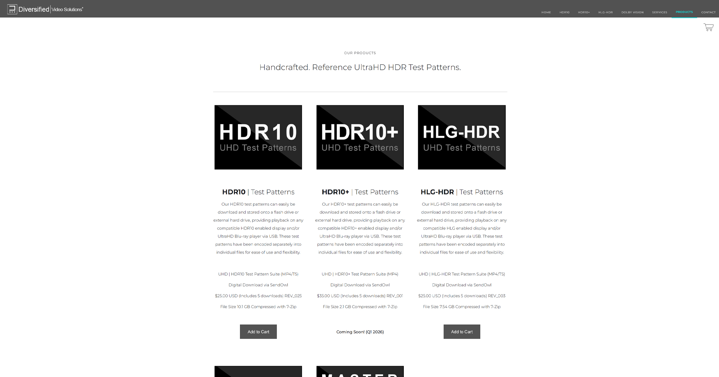
También se recomienda desde los discos de calibración más importantes del mundo, los cuales incluyen patrones y recomendaciones muy especificas para un correcto entorno de visualización bad condiciones de luz controladas. Por ejemplo, los patrones de referencia internacional Mascior, que cuenta con soluciones para todos los estándares, incluidos patrones DOLBY VISION
Handcrafted. Reference UltraHD HDR Test Patterns.
A comprehensive set of reference 4K UltraHD test patterns that encompass all of today's latest HDR standards. HDR10, HDR10+, HLG-HDR, and Dolby Vision. Our products come in a variety of options from downloadable digital file sets, bundled packages, we even provide a fully authored UltraHD-HDR...
diversifiedvideosolutions.com
Miscellaneous Patterns continued
Ambient Light Test Patterns
These patterns offer a means to adjust ambient lighting (aka: bias lighting) on the wall behind the display via a visual comparison to the brightness of the various windows. Many users of this program will not have access to a spot photometer or suitable spectroradiometer to measure the luminance on the wall. The study of human visual perception is at the foundation of the video medium. Human vision is the basis of imaging science and technologies that seek to produce artificial images. Ambient lighting and surrounding colors in the viewing environment affect how the viewer perceives the image on a TV screen or electronic monitor. An otherwise "perfectly" calibrated display cannot deliver a reference image to the viewer in a non-reference environment. Video industry standards bodies (SMPTE, ITU, EBU, ATSC, etc.) and video engineers have understood these principles for over a half century.
A 'Reference Viewing Environment' has been specified to include a neutral gray "surround" and low level back lighting that is CIE D65 (aka: 6505K CCT) behind the monitor for decades. The room is to be devoid of any substantial additional lighting. These reference conditions are designed to minimize screen reflections, haze, and glare, plus relieve eye strain and preserve accurate color perception. All of the current display calibration specifications are taken from the standards
best practices used in the professional mastering of video programs. Such standards and best practices are used throughout the industry to insure consistent and unified program production, post-production, and program reproduction (image fidelity).
This UHD/HDR10 calibration program is primarily intended for the newest video displays. The most recent revision of reference viewing environment standards and recommended practice by the Society of Motion Picture and Television Engineers (SMPTE) specifies a formal standard of an ambient light level of 5 nits (cd/m2). This is also the most recent recommended practice specified for HDR imaging by the International Telecommunications Union (ITU). Both of these standards bodies specify the display to be calibrated to 100 nits for peak white, using a specific sized window pattern. The ambient light level visual comparison patterns in this program have 5, 10, and 15 nit windows derived from the formula for calculating the electrical optical transfer function (EOTF}, or Perceptual Quantizer Transfer Function (PQ), for HDR (SMPTE ST 2084:2014). The 10 and 15 nit window patterns are for comparison with older recommended practice as noted in the patterns.
How to use the patterns
Simply display the pattern of choice after calibrating the display while visually adjusting the ambient lighting on the wall behind the display in an otherwise light-less room. Visually compare the level of light on the wall to the level of light in the window. PLUGE patterns are included with the window for tweaking the black level (aka: brightness) of the display with the ambient light present. This is to insure the adequate perception of shadow detail in the final image.
Miscellaneous Patterns continued
5 nit window pattern: Above the window- "Ambient Light Level Visual Comparison“ Below the window- "Formal standard of 5 nits (cd/m2) SMPTE ST 2080-3:2017, for HDTV“, "ITU-R BT.2100-0-(07/2016), recommended practice for HDR"
10 nit window pattern: Above the window- "Ambient Light Level Visual Comparison“ Below the window- "Recommended practice of 10% of a peak white at 100 nits (cd/m2)“, "SMPTE RP 166-1995, for SDTV; ITU-R BT.2035 (07/2013), for HDTV"
15 nit window pattern: Above the window- "Ambient Light Level Visual Comparison“ Below the window- "Recommended practice of 15% of a peak white at 150-250 nits (cd/m2)“, "ITU-R BT.710-4 (11/98), for consumer HDTV environments"
Incluso los discos de calibración, todos, de Spears & Munsil, lo recomiendan, e incluyen patrones Ambient Light Test Patterns para ajustar convenientemente el entorno de visualización.
Bias Light
These patterns are designed to be a reference when setting up a bias light behind or around your display.
If you choose to use a bias light, decide whether you would prefer a 10% or 15% light, then use the appropriate pattern to show a reference on screen. Put the pattern up on screen, set up the bias light behind the display, and adjust the dimmer or mask the bias light so that the light spill right at the edge of the display matches the intensity of the on-screen rectangle.
Note that the reference is calculated in linear space, so if your display is not calibrated to 2.4 gamma, the reference level will not be perfectly correct. It should be close enough for this specific purpose of setting up a bias light.
Y sobre tecnología OLED
Bias Lighting and OLED: Why do I need Bias Lighting when my OLED produces "perfect" blacks.
A lot of people mistakenly believe that bias lighting will result in crushed blacks. You won't get black crush with brightness levels set correctly both on the display and on the bias light. Above the zero state, there are many levels of brightness. HDR and 4K both introduce more detail which will absolutely get lost during scenes with specular highlights and a darkened room, just to give one example.
If wide swaths of your display are totally black right now, you are probably already crushing blacks. If you use a PLUGE pattern -- some are available to stream on YouTube --just ensure that they include below black levels as some encoding can crush "illegal" black levels. Here's a reference for bias lighting that includes a PLUGE pattern on the sides. (excuse the music
) If you can see the bars, you definitely aren't crushing blacks.Besides the capability of the display, we have the content, which doesn't always go to zero. So the content can also look better in spite of the capabilities of the display (SDR 8-bit content - and that's a lot of it, for example). But to fixate on the darkness when HDR offers so much more, I think shortchanges many of the benefits of OLED.
Hollywood colorists grading on professional OLED monitors use bias lighting too. It's not about picture quality of the display but rather our ABILITY to see that picture quality. It's how (non-prescription) sunglasses can improve our vision when driving our car. Putting aside the fact that it absolutely has ergonomic benefits, it enhances our ability to see the picture. The color appears more vivid and the picture is often sharper. Why sharper? The photopupillary reflex narrows the pupils and just like when we stop down a camera, a greater depth of field falls into focus.
Our home theaters are digital, HDR, 4k, but our eyes are much more refined and sensitive analog/human factors in determining what we see. What looks great to us now in home theater technology ALWAYS inevitably sucks in 10 years when the next technology comes along. Remember when we said we couldn't even see the pixels on 1080p? Remember 1080i? We obviously all know that the picture can get better because it always does, as does our ability to pick it apart.
Joel Silver from ISF likes to say that everyone has opinions about how to set up a TV, but there are defined standards that are accepted internationally. We're all entitled to our preferences too. When I'm working on my computer for non color-critical work, I set my bias lighting much higher than the standards.
https://www.biaslighting.com/blogs/...lighting-when-my-oled-produces-perfect-blacks
Joe Kane
También tenéis opiniones profesionales aquí, en este tema de Avsforum
Bias Lighting?
Strange. I just tried using the coupon on the website and it was accepted. Just make sure you've added the Quad system ($89.99). Code doesn't work on other systems. I'll try again thanks Sent from my iPad using Tapatalk
"Sticky" threads from the calibrator forum regarding bias lighting and video viewing environment principles:
'D65 Video Bias Lighting- Fundamental Theory And Practice'
https://www.avsforum.com/avs-vb/showthread.php?t=1162578
'How Viewing Environment Conditions Can Corrupt Or Enhance Your Calibration.'
https://www.avsforum.com/avs-vb/showthread.php?t=849430
Also:
'The Room Is A Video Component'- Home Theater Geeks #182- Video Interview
https://www.avsforum.com/forum/138-av...#post_23953177
Also:
'The Importance of Viewing Environment Conditions in a Reference Display System'
http://cinemaquestinc.com/ive.htm
Best regards and beautiful pictures,
G. Alan Brown, President
CinemaQuest, Inc.
SMPTE, THX, ISF, Lion AV Consultants
"Advancing the art and science of electronic imaging"
How Many Display Calibrators Ignore This?
"The creation of television images that are intended to follow a standard of consistency in reproduction requires definition of a reference display, of a controlled viewing environment, and of a set of measurement procedures to enable consistent calibration of both display and environment. This...
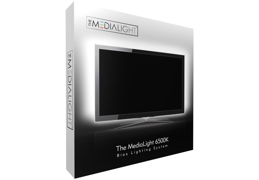
Y yo personalmente recomiendo esta solución.
MediaLight 6500K Bias Lighting System
July 1, 2020: We have a new range of products called MediaLight Mk2 with CRI ≥ 98 (TLCI 99) and a wider range of sizes. The MediaLight Mk2 costs less on a per-meter and accessory basis than the MediaLight Original with better specs. Please check out The MediaLight Mk2 to see if it is a better...
www.biaslighting.com
Esa es una solución que cuenta con la debida certificación 6500K para una óptima visualización y que funciona francamente bien.
Diferencias entre una luz de sesgo certificada D65 y una que no lo está. La certificada es la solución de MediaLight, y la segunda es una tira de leds de unos 20 euros de Leroy Merlin.
Certificada 6500K
NO certificada
Última edición: